The design of Game of Thrones
The final
season of Game of Thrones started this Sunday, and since it’s such a beloved
series, let's celebrate the design of one of the best TV shows of all-time.
Game of Thrones has redefined the design values of television, not simply by spending
an exorbitant amount of money on its production (each episode in the final
season cost a record $15 million, and it took 55 days to film the highly anticipated
Battle of Winterfell) but by planning and executing every element of the show’s
design with intelligence, perspicacity, and ingenuity.
The opening title sequence
Let’s
begin with the outstanding opening title sequences, designed by Elastic in
Santa Monica, as an inspiring example of how titles can clarify the twists and
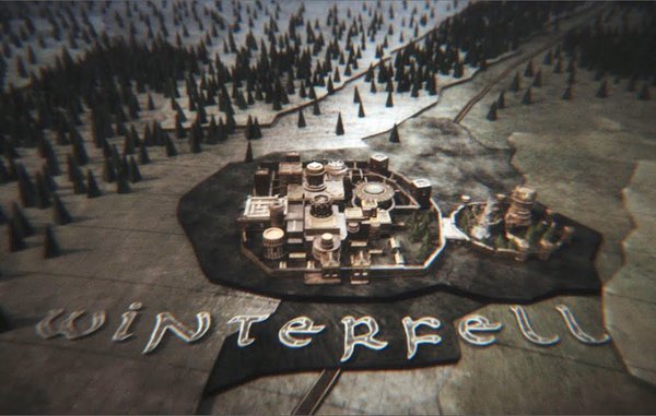
turns of an unusually complex plot. Each sequence consists of a spherical map
of the mythical world portrayed in the series. The camera pans around the
sphere zooming in on the places featured in the plot of each episode, creating
a custom-made introduction for every episode. The debut sequence focused on Kings
Landing, Winterfell, The Wall, and Pentos. The first three have since appeared
in all subsequent sequences, but everywhere else has changed, with new
locations emerging, most recently Eastwatch and Oldtown in Season 7, and old
ones disappearing, as Pentos did after the first episode, only to return in
Season 5 when Tyrion stayed there while fleeing Kings Landing with Varys.
The sigils
When
aristocratic warriors started to wear full armor in battle in the 12th century,
they found it very difficult to tell friend from the enemy in the thick of a fight.
The design solution was for them to identify themselves by choosing a pictorial
symbol, typically one depicting an aspect of their ancestral homes or military
exploits, that could be attached to breastplates and shields where it would be
clearly visible. These symbols were called armorial bearings. Game of Thrones has
its own version of armorial bearings, the sigils identifying each warring
house, plays such a useful role in the show. The supporters of each house
proudly sport their sigils on banners, sword pummels, shields, seals and
anywhere else that can bear them. A direwolf for beloved House Stark. A lion
for the dainty, (mostly) odious Lannisters. A dragon for Daenerys, Mother of
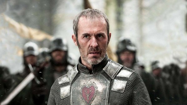
Dragons and fellow Targaryens. A stag for deceased King Robert and House
Baratheon. The sun and a spear for the ferocious Martells in sunny Dorne, and
so on. Sporting sigils make it easier to follow the fortunes of the warring
camps during battles and to chart changes of ownership of the various castles.
The best sigil is, obviously, the Starks’ direwolf, although the Kraken, an
ugly sort of giant squid makes rather an imposing sight on the sails of the Greyjoy’s’
ships.
The gowns
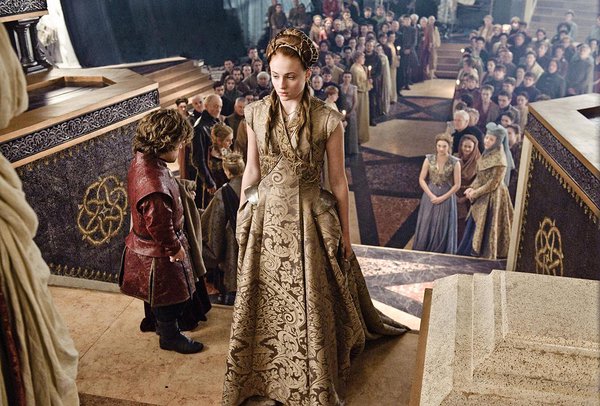
When the dreary Sansa Stark prepared for her arranged marriage to Tyrion Lannister, her wedding gown was embroidered with direwolves
fighting with a lion. The Wolves lost. The meaning could not have been clearer.
As the direwolf is the Starks’ symbol and the lion the Lannister’s, poor Sansa
had been forced to wear a wedding dress that depicted her family’s defeat and
her persecutors’ triumph. Several seasons later, after Sansa has escaped both
the Lannisters and her sociopathic second husband Ramsay Bolton, she signifies
her growing strength and newfound freedom by embroidering her chosen motif of a
battle-ready direwolf on her dress. Every clothing item in Game of Thrones is meticulously
planned by the show’s costume designer, Michele Clapton, to reflect the twists
of the plot and the fate of each character. The designs are then meticulously
executed by the army of embroiderers, armorers, jewelers and other artisans who
work on the show. Daenerys begins Season 1 as a barely clad teenager whose
brother trades her to a Dothraki warrior for a shaky promise of military
support. After landing in Westeros at the end of Season 6 to claim the Iron
Throne, which, or so she believes, is her birthright, Daenerys’s flesh is
concealed beneath sleekly tailored militaristic tunics in somber blacks, greys, and silvers with flashes of House Targaryen’s signature color, red. Daenerys’s
also wears a heavy silver chain with links resembling dragon scales and a
dragon’s head in lieu of what she really wants - the crown. The wardrobe of the
odious Cersei Lannister follows a similar course, as she exchanges the flowing,
feminine gowns of her early scenes with her children and their father, her
brother-with-benefits Jaime, for her own tailored armor in the same somber
palette and strong silhouette but embroidered with her house’s lions. Like
Sansa, Cersei and Daenerys have covered up to look as powerful and imposing as
possible and, of course, because winter has come.
The sets
There
is tough competition for the best designed set in Game of Thrones. The
sentimental votes go for Winterfell, of course. Though some of the best designs
are Daenerys’s private chamber in the Great Pyramid of Mereen and the Iron Bank
of Braavos. The former’s design was inspired by the dramatic use of light and
pattern in Frank Lloyd Wright’s Mayan Revival architecture in Los Angeles, such
as his 1924 Ennis House. While Deborah Riley, the show’s production designer, and art director, modeled the latter on a photograph of a single corridor
designed by Albert Speer in his role as Adolf Hitler’s favorite architect. She
wanted the Iron Bank’s lair to exude the power, confidence, and certainty of
Speer’s design. While very fascinating, both sets are washouts of the Targaryen'
throne room on their ancient fortress, Dragonstone. All of the visual cues are
taken from the flysch, the jagged rock strata on the cliffs at Itzurun Beach by
Zumaia in northern Spain, where the scene of Daenerys's return to Dragonstone,
her birthplace, was filmed. Casts were made of the rocks, so Riley and her team
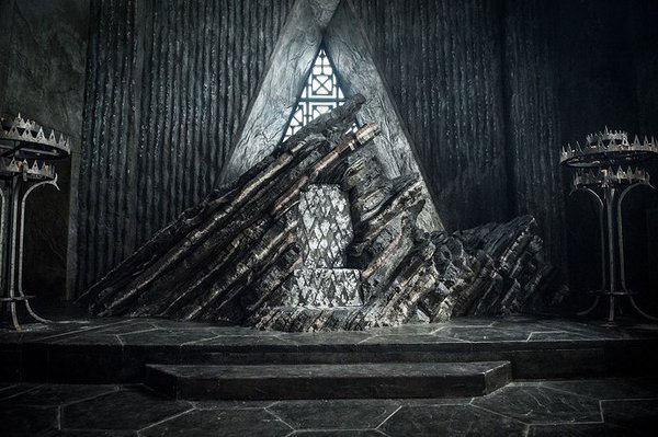
could replicate them for the interiors. The throne room was designed as a
carefully composed series of geometric forms: diagonal rock strata encase the
throne, which is etched with the four-sided diamonds; searing horizontal steps
lead towards it; the floor is paved with hexagonal slabs of stone. More
geometrics appear on a vast triangular window. Riley drew inspiration from the
central plaza of Louis Kahn’s 1965 Salk Institute in La Jolla, California for
the set, as well as from the gothic grandeur of medieval churches. Though the
Dragonstone throne room also evokes the drawings of the brilliant film
production designer Ken Adam, who deployed a similar combination of bold forms
and strategically positioned shafts of light to create the War Room in Stanley
Kubrick’s ‘‘Dr. Strangelove‘‘ and the ominously opulent lairs of vintage Bond villains.
The weapons
As
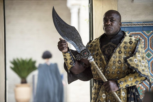
you’d expect of as bloody, brutal and cutthroat a show as Game of Thrones, it
has assembled a formidable arsenal of weaponry, much of it designed with horrendous
genius. When it comes to choosing a favorite weapon of death and/or destruction
from the show, the temptation leads us to the Night King’s new toy, the zombified version of Daenerys’s dragon, Viserion, if it wasn’t too much of a
stretch to describe it as having been designed. Luckily there are lots of
alternatives, take the sharply crafted swords: from family heirlooms, like the
Mormont’ Longclaw, now wielded by Jon Snow, and Oathkeeper, the Valyrian steel
beauty that Jaime Lannister gave to the mighty Brienne of Tarth; to the nifty
Needle that Jon asked the Winterfell smiths to forge for Arya. Then there are
the bespoke weapons. Take the version of the corvus used by Ancient Roman
warships to enable their crews to board and raid other vessels that were
designed for evil Euron Greyjoy’s longship The Silence. Then there is the
scorpion, devised by creepy Qyburn to pierce the skulls of Daenerys’s dragons,
but failed to do so when Bronn fired it at the Battle of the Goldroad. Yet in
the spirit of optimism the choice of best-designed weapon is the plethora of
swords, daggers, spears, arrowheads and other armaments made from Westeros’s
answer to obsidian and the doughtiest weapon against the Army of the Dead, the
ancient volcanic glass, known as dragon glass.
The hair
After
Jon Snow was slaughtered by his enemies within the Night’s Watch in Season 5’s
finale, the internet erupted when Kit Harington, the actor who plays him, was
photographed near the Game of Thrones set in Belfast with Ben Crompton, who
plays Jon’s trusty comrade Eddison Tollett. Not only was Harington back on set,
he still sported the long, curly hair he had worn throughout the series, fueling
speculation that Jon was alive after all. He soon was, thanks to the Red Woman’s
sorcery. As Jon’s fortunes when up and down throughout the series, his hair
morphed from the unruly curls he wore as a glum teen at Winterfell, to a
purposeful man bun as he rose up the ranks of the Night’s Watch, and, in his
newish role as King in the North, to a half-do like that of his father/uncle
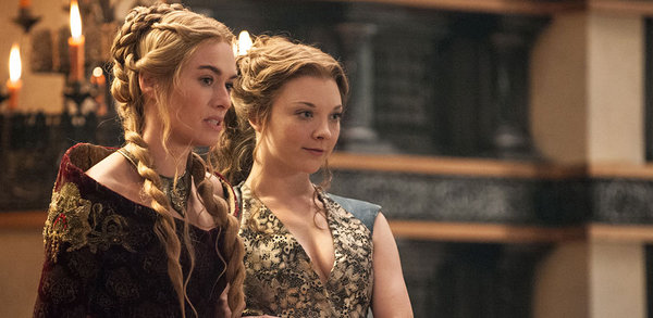
Ned Stark. All the hairdos on Game of Thrones are equally rigorously coded. The
odious Cersei's long blonde locks are chopped off by the Seven for her Walk of
Shame through King’s Landing, whereas the seemingly more compliant Margaery’s
are simply straightened. The raggedy hairdos of Arya, Yara Greyjoy, Brienne of
Tarth, Ygritte and every other woman of action signify that they have better
things to do with their time (killing, maiming, etc) than to wait for someone
else to braid their hair as prettily as Sansa’s and Daenerys’s. As for the
genial red priest, Thoros of Myr, he is teased mercilessly by The Hound for
trying - and failing - to disguise his baldness by tying his hair into a top
knot. Though when it comes to top knots, plaits, ponytails. half-dos and any other forms of hairstyles, Daenerys’s first love, the Dothraki warlord, Khal
Drogo reigns supreme - for his beard alone.
The designers
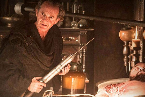
None of them identify themselves as designers, yet many of the characters in Game of Thrones fulfill that role, instinctively and unknowingly. Who’s the best designer on the show? Sansa for the skill with which she runs up her own outfits, and even battle gear (wolf pelts included) for Jon? Gendry for his weapon-making skills as a blacksmith? The otherwise rather wussy Maester Wolken scores high points for inclusive design by constructing a wheelchair for Bran after his return to Winterfell as The Three Eyed Raven. As does Tyrion for his technical drawings of an adapted saddle for the recently crippled Bran, while winning more points for designing what he frequently describes as the peerless sewers of Casterly Rock. Impressive though all of this sounds, none of them succeeded in designing as fiendish a weapon as a dragon-killing (or wounding) scorpion or as prescient an example of artificial intelligence as the robotic killer, Ser Gregor Clegane. Much as we hope that he will meet a suitably grisly end in Season 8, ideally at the hands (or robotic fists) of one of his creations, the vote for Game of Thrones’s top a designer is the disgraced Maester turned Hand of the Queen to Cersei Lannister, the spooky sinister, but relentlessly inventive, Qyburn.
This article has been put together from Alice Rawsthorn (British design critic) recent Instagram posts about Game of Thrones.
