Bevira
Bevira is a business software that helps businesses save time by automising their business processes.
They approached us with a revolutionary attitude and basically wanted to say „f*ck paperwork, f*ck pdf“ – the way accounting still works today is outdated and needs a reboot. To be convincing with their attitude they needed a rebrand that could speak the same language. Something that is modern and easy to understand – a brand that can speak to everybody.
Solution
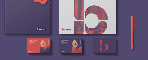
As their software consists of multiple modules the letter B in the logo is made up from different modules and is designed to remind the viewer the hand gesture OK showing that your business is under control with Bevira. The combination of the human-ish soft-edge thumb and the robot-like looking pointing finger symbolizes the humanly and friendly attitude of the Bevira team and software. A perfect symbiosis between technology and humans. The Bevira brand is also a very colorful brand with purple and red as the main colors which also make the Bevira gradient but there is also yellow, green and orange in usage next to black and white. The typeface used for Bevira is GT Walsheim – a really good reading font with very nice characters.
Illustrations
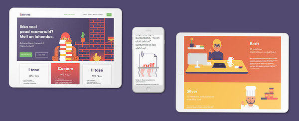
Speaking of characters – the main aspect of the brand is certainly the illustrations. Different characters that act as different client examples and show everyone how the Bevira brand works, what do they actually do and how they can help you specifically. The characters are from very different work fields and thus show the variety of people that the Bevira software can help. All the characters are showing the OK hand gesture which was a little detail we added so people could understand the idea behind the logo better and connect the dots that bring the brand together.
Design Studio: Bynew


