Type masters of Tallinn - Tüpokompanii
Aimur
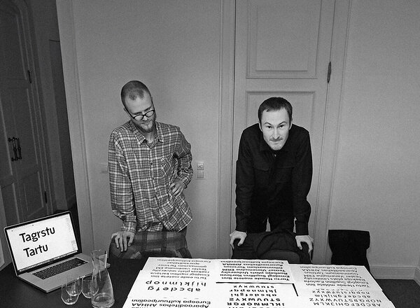
Takk and Andree Paat. Photo: Alari Orav
Who is Tüpokompanii?
Andree Paat (born in 1992) graduated from the Graphic Design department of the Estonian Academy of Arts (EKA, EKAGD) in 2016, after which he went on to do an internship at Commercial Type in New York in 2017. He has collaborated on various typeface projects with Dinamo in Berlin since 2018, and also operates under the moniker Kirjatehnika. Andree has been a visiting teacher at the Graphic Design department of the Estonian Academy of Arts since 2018.
Aimur Takk (born in 1993) is a freelance designer working across disciplines, focusing mainly on typefaces and visual identities. He graduated from the Graphic Design department of the Estonian Academy of Arts in 2016 and has studied typeface design at HfG Offenbach (2015–2016) and ÉCAL Lausanne (2018–2020). Aimur has created custom typefaces for the ERKI Fashion Show (2017), IDA Radio, and Tallinn Music Week. He has been a visiting lecturer at the Graphic Design department of the Estonian Academy of Arts since 2017 and is one of the initiators of ??? Summer School in Estonia.
Typography
is all around us by default, however, very few people start designing
their own typefaces. When did you become interested in typography,
and when and how did you come to create Tüpokompanii?
Our
common interest in typography and type design started at the Estonian
Academy of Arts, where we studied in the Graphic Design department
from 2013-2016. A pivotal moment was the font design workshop during
our second course, conducted by Johannes Breyer and Fabian Harb,
founders of Dinamo type design studio. Each student had to collect
miscellaneous materials in a short amount of time and create a new
typeface within a week. The results were typefaces based on, for
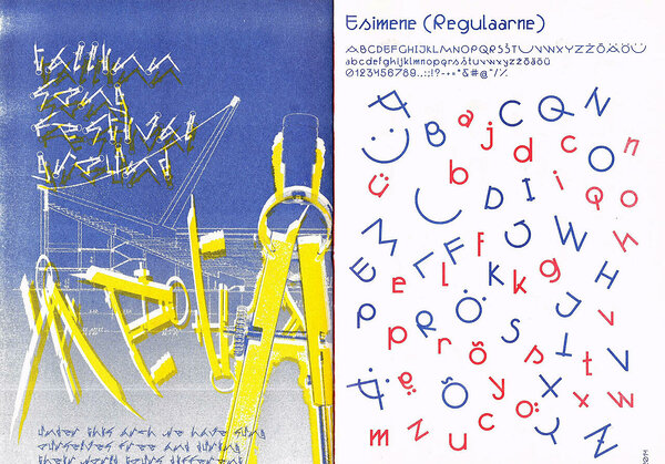
example, a pair of compasses, earphone wires or pretzels. We busted
the myth for ourselves that creating a typeface must be a complex
process that takes years (sometimes that is indeed the case, but not
always). This experimental introduction to the world of type design
encouraged us to continue similar explorations during our further
studies. There was no turning back, and both of our undergraduate
theses were also on type design, so we probably created over 20 fonts
between the two of us.
The first fonts (2014). Aimur’s “A Pair of Compasses” (“Sirkel”) on the left, and Andree’s “First” (“Esimene”) on the right
It
is quite rare that there would be two “typefaced guys” in the
same year, who would also continue on to work in the small field of
type design. After graduating from the Estonian Academy of Arts,
Aimur interned at the AKU design agency and studied type design at
ÉCAL Lausanne, Switzerland. Andree worked as a graphic designer at
the Stuudio Stuudio design studio and improved his type design
knowledge through internships at Commercial Type, a type design
studio in New York, and by working at Dinamo Studio in Berlin. We
agreed when we left school that, one day, we would set up our own
type design studio. Six years and 1,337 font design files later, the
moment seemed right, and so, in 2022, we founded Tüpokompanii.
Why is typography important in design? What tools do you use?
Typography is one of the fundamental tools of visual communication, a means of making language readable and creating a hierarchical system of information. Typeface gives the text a 'tone of voice', so the choice of typeface must also be made with an understanding of the context of the material being designed. The selection of tools depends on the purpose; we use both physical tools such as paper, pen, and paint roller, as well as digital software such as Glyphs, Adobe programs, Figma, and others.
It is essential to point out the
difference between the concepts of typography and type design -
typography deals with the so-called macro level, i.e. the layout of
texts, sizes, selection of a font, line spacing, etc.; type design
deals with the micro level, i.e. the letters themselves and the form
between them. A type designer creates a typeface, i.e. a tool that a
typographer uses to type words, sentences, and paragraphs.
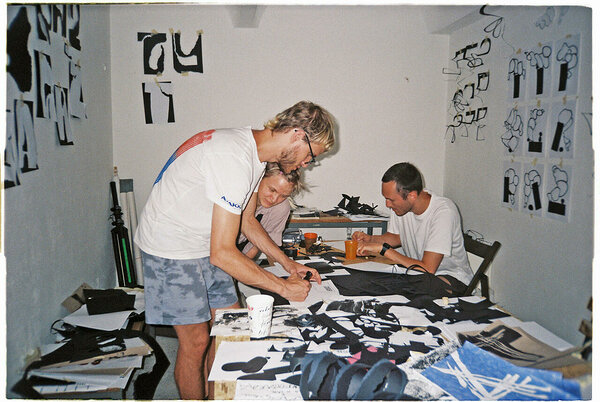
Typogaráž
workshop in Bratislava, Slovakia (2021). From the left Aimur, Nele
Kurvits, Andree. Photo: Rudolf Vychovalý
What is the workflow for creating a new font? Where do you start?
Generally,
projects start with a conceptual or formal idea, followed by a
systematic transferring of this idea onto each letter. This initial
exploratory phase is the most playful and creative part of the
process, which tends to pass quickly. This is followed by the
production phase, which is more technical and routine-based work and
takes up the lion's share of the time and energy spent on the
project. A single widely used typeface set might contain, for
example, 10 different font styles with italics, each with ~600
characters (Latin, Cyrillic, numerals, punctuation, symbols, etc.).
Even though some of the workflow can be automated, even in that case,
it would be necessary to go over and check around 12,000 characters
several times manually. At this stage, unfinished creative projects
often tend to “stay in the drawer” for months or years, maturing,
so to say.
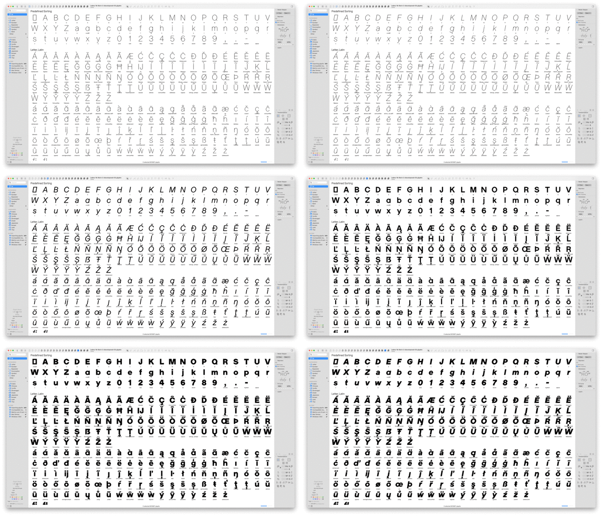
A typical work file of a type designer
The
idea of a new typeface can be inspired by visual culture in general
and can arise from your own drawings/experiments with form, or from
reinterpreting the typefaces of other authors, making them “your
own”. Many modern typefaces draw on the work of masters of previous
generations and deal with the interpretation of old drawings using
digital tools. We stand on the shoulders of giants, as they say. We
are quite avid collectors of local literary heritage, and several of
our typefaces also try to relate to and draw attention to/ignite the
potential of the often forgotten work of authors from this region
here.
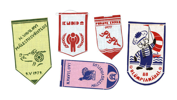
The inspirational material for the typeface Trafarett: Pennants designed by Aimur’s
grandmother, Maie Takk
Could you describe your client(s)?
We
are mainly approached by graphic designers, both from Estonia and
abroad, who refer our fonts to their clients for whom they provide
design services. More conscious designers who are looking beyond
convenient solutions such as Google Fonts, Adobe Fonts, etc. and are
looking for something more unique, and who are also interested in the
background of typefaces. Also, local designers who want to use
so-called 'local produce' in their work. End-clients range from
individuals to organisations, from the cultural sector to
corporations, in both the public and private sectors. Sometimes, we
also get clients who commission graphic design, and we try to use our
own fonts for these projects.
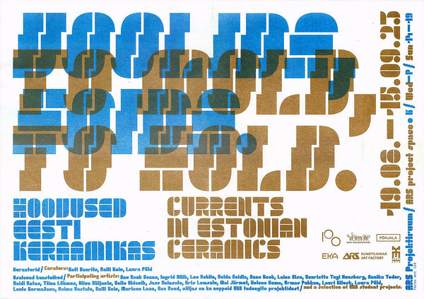
The typeface Trafarett in use. Graphic design by Jaan Evart.
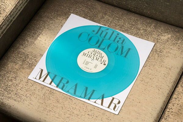
The typeface Siluett in use. Graphic design by Koln Studio. Photo: Adrià Cañameras
Do typefaces have trends?
As with design in general, yes, but since type design is usually a long-term process, then by the time the font is ready, the climate has changed already. We can try to predict what might become popular in the near future and try to be ahead of the curve, but since we are not convinced of our clairvoyant abilities, we try to stay true to our own interests and not be overly influenced by the actions of others. Authenticity is always in fashion.
What have you learned from your work, and what recommendations would you have for future typographers?
Learn to create your own typefaces and try to find ways to use them at the earliest possible stage. Testing fonts in existing designs can influence the design of the font itself, and vice versa, a self-made font can breathe new life into a design. Start several projects at once and take time to reflect; working hard on one project alone makes it difficult to make design decisions, and time away from one project will help you see things more clearly later. Keep up the learning spirit, and don't be afraid to make mistakes, or to question the rules.
How does digital typography differ from the typography of printed materials?
If you look at the text on a high-resolution screen or offset-printed on high-quality paper, then, essentially, there is no difference - the result is equally clear and sharp to the human eye. Today's technology has achieved ultimate precision, which is impressive, but with it comes a certain coldness. With older printing technologies, different shifts that were out of the designer's control could happen, and these inaccuracies made the printed materials feel warmer and more human.
Which result are you most proud of?
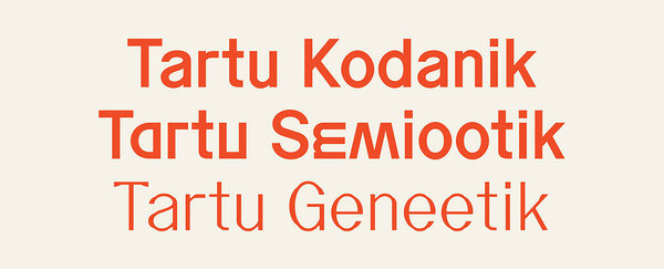
One of the most successful and largest projects has been the typefaces created in 2022 as part of the new visual identity of Tartu City in cooperation with AKU. When it comes to bespoke fonts, the important question for us is what the letterforms refer to and whether it is possible to hide something more meaningful within an interesting form.
In this project, the main impetus for the formal language were the old handmade street sign inscriptions, which can be found in Tartu in abundance, and which we thoroughly documented. This was the origin of the typeface Tartu Citizen. Because this is a headline rather than a text font, we were able to leave in a number of deliberate errors in the letterforms, which would stand out on a larger scale.
On a conceptual level, we tried to relate to a discipline strongly linked to Tartu, namely the discipline of semiotics, which studies sign systems and their meanings and interpretations. In the Tartu Semiotic typeface, selected letters are twisted in a way that they would resemble other letters, thus changing their meaning. For example, an upside-down letter M becomes a W, a U turned sideways becomes a C, etc.
The third typeface, Tartu Genetics, is based on the same “skeleton” as the previous ones but is thinner and more elegant in form. When we drew it, we imagined ourselves as street sign painters tasked with creating festive lettering, but because the tools were not of high enough quality, the ink ran out in the middle of the stroke, and thus, the letters turned out a little wonky.
In the case
of the Tartu project, the result is a set of typefaces that are not
only interesting to look at but whose formal language is more deeply
connected to the city's local context. We applaud a rare client who
dared to look beyond the excessive refinement and ambiguous buzzwords
like “friendliness”, “openness”, etc., that are so prevalent
in the branding world, and instead trusted the designers and chose a
more eccentric path.
Tartu typefaces
How to stay up to date with new trends in typography? What are the specific publications in this area that one should be monitoring?
Fonts in Use is one valuable online platform that brings together examples of recent and older typo-focused graphic design examples and provides a comprehensive mapping of all the fonts used and their background information. If you want to look beyond the mainstream and support smaller studios, you can check out the typefoundry.directory page, which has a comprehensive list of indie design studios.
Regarding physical publications, the design studio Actual Source has produced two large collections of contemporary typefaces: Shoplifters, which has achieved a certain cult status among designers interested in fonts, and the Type_01 magazine, launched in 2019, which also keeps a close eye on trends and has gained popularity among younger designers. A lesser-known publication, Footnotes, publishes studies on typography. One might get the impression that these articles are a rehashing of old stories, but the additional facts found by the researchers, for example, that sometimes even refute inaccuracies regarding the authorship of well-known typefaces, provide a breath of fresh air.
From the audio media, we
would like to point out the Interrogang (Proof&Co.)
and Ohno
Radio (James
Edmondson) podcasts.
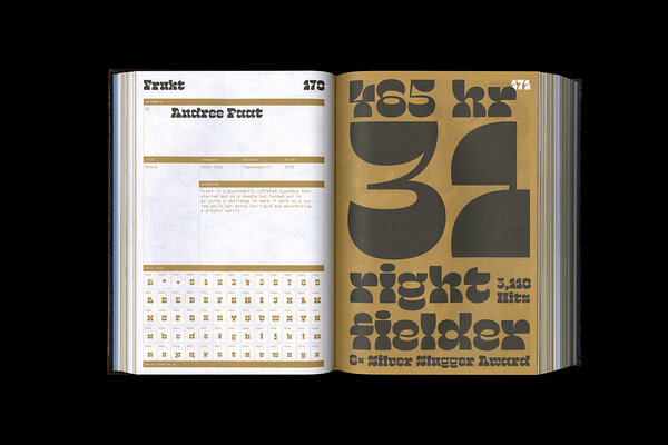
The typeface Frukt in the collection Shoplifters 10: New Type Design Vol. 2
What are your ambitions in the typography field, and where do you hope to be in five years' time?
We hope that our activities will contribute to the overall level and awareness of typography in Estonia and enrich the local design field, but we are also working towards achieving international recognition in the field of typography. At some point, we would be happy to publish other authors' typefaces through Tüpokompanii. Our “digital drawers” are full of unfinished projects, dealing with which tends to get postponed - in five years' time, we hope to have a better work-life balance so that we would have more time to work on these projects as well.
With or without serifs?
With
zephyrs.
Illustration
by Patrick Zavadskis
